Responsive frameworks are used by developers all around the world to ease the pressures of a full and complicated development process. They allow you to build a website using a grid-based layout with pre-defined base codes, meaning the developer does not need to spend a huge amount of time creating a grid structure from scratch to use throughout the development of a site.
Responsive websites also allow the website to smoothly scale to a wide range of different sized devices without the need for an additional mobile/device specific site and these responsive frameworks help speed up the process.So lets get started with our list, please note this is not in order of popularity or favouritism.
1. Gumby
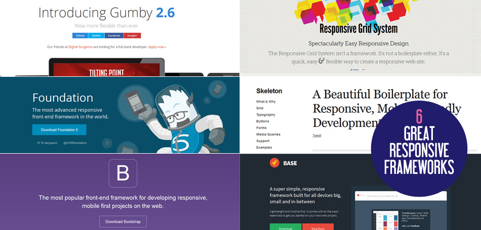
 Gumby is a responsive CSS framework that's built with Compass and SASS. A hybrid grid is the foundation of this framework, allowing the user to create layouts using different grids. The use of SASS makes Gumby a high-speed framework with a selection of tools designed to enable the user to build upon the base framework customise specifically to your needs. Users have the use of the resolution-independent integrated En-typo Icons for any project.
2. Foundation
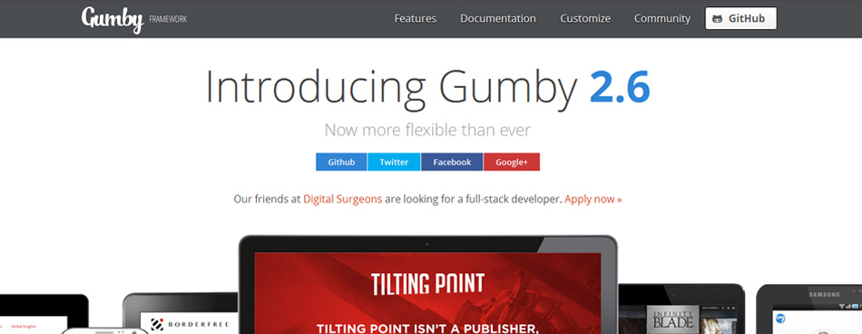
 Foundation is a lightweight front-end framework from ZURB, this framework enables the user to create complicated layouts without the need to create a large number of custom elements. This is achievable thanks to the 12-column grid which is able to scale down to arbitrary sizes defined by the maximum width of the rows. It includes a command line tool enabling you to spin up projects faster than before, it also features Libass, to speed up your SCSS chances by 500%. HTML partials are enabled by Interchange and allow for device specific content, making it quick to use for the user as well as increasing development times.
3. Skeleton
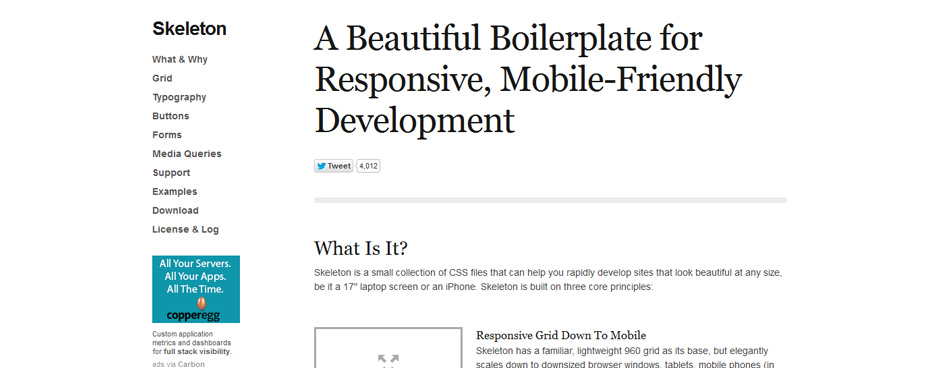 Skeleton is a small responsive framework designed for the rapid development of websites of any size. The lightweight 960 grid base scales down to mobile phones, tablets and other devices without losing quality. It has basic foundation designs , basic UI elements, including forms buttons and tabs, as well as an organised file structure to make this framework easy to use with a short development time. Skeleton embraces the future development of products made to view websites with it's media queries being mainly targeted at maximum and minimum widths as opposed to set device sizes and specifications.
4. The Responsive Grid System
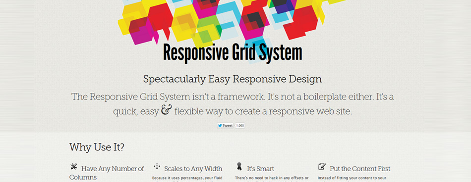 The Responsive Grid System claims not to be a framework, or a boilerplate, but a 'quick, easy & flexible way to create a responsive website'. This development tool will easily plug into existing CSS and HTML and prevents the user from being limited to a fixed number of columns, allowing unlimited columns to give you exactly what you want. Very simple, yet flexible and has easy to follow instructions on the website. Be sure to check out the calculator which outputs the code you need depending on your column and margin input.
5. Base
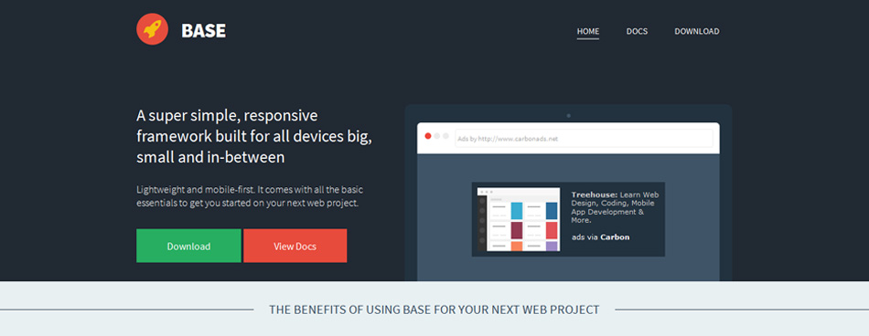 Base is a great simple responsive framework developed in SASS/LESS a powerful CSS pre-processor that helps you write cleaner, more organized and well structured CSS that can easily be maintained over time. It's designed for use with a wide range of devices, from mobile phones, tablets, PCs, and netbooks and includes all foundation styles for block-quotes, forms, lists, tables, typography etc.
6. Bootstrap
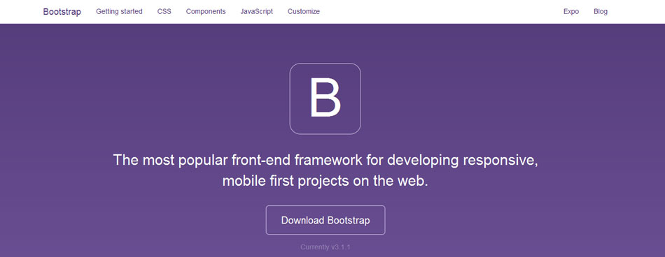
And last and not least, Bootstrap. I am sure you all know Bootstrap is one of the most popular responsive frameworks out there, it is a front-end framework that's designed to make front-end development easier and faster for everyone. Regardless of your skill level, Bootstrap is easy to use and is suitable for projects of all sizes. This popular framework has the ability to scale your projects with one code base, and can be applied successfully over several mediums, from phones to PCs. The Bootstrap customizer allows you to personalise your framework by adjusting the wide range of components, JavaScript plugins etc. Support for Vanilla CSS, LESS and SASS is included with the Bootstrap framework.
There are numerous responsive CSS frameworks available to anyone who desires to use them, and there is a fair bit of variation regarding the usability, features and other aspects of these frameworks. Before choosing the framework be sure to consider your specific needs so you can find the framework that will work best for your individual project. This list is not a definitive list of the best frameworks out there, it is just intended as a guide to demonstrate some of the frameworks out there.

Comments
No comments yet.