10 Font Combinations for Design Project
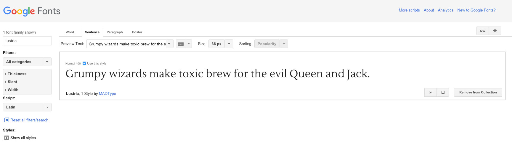
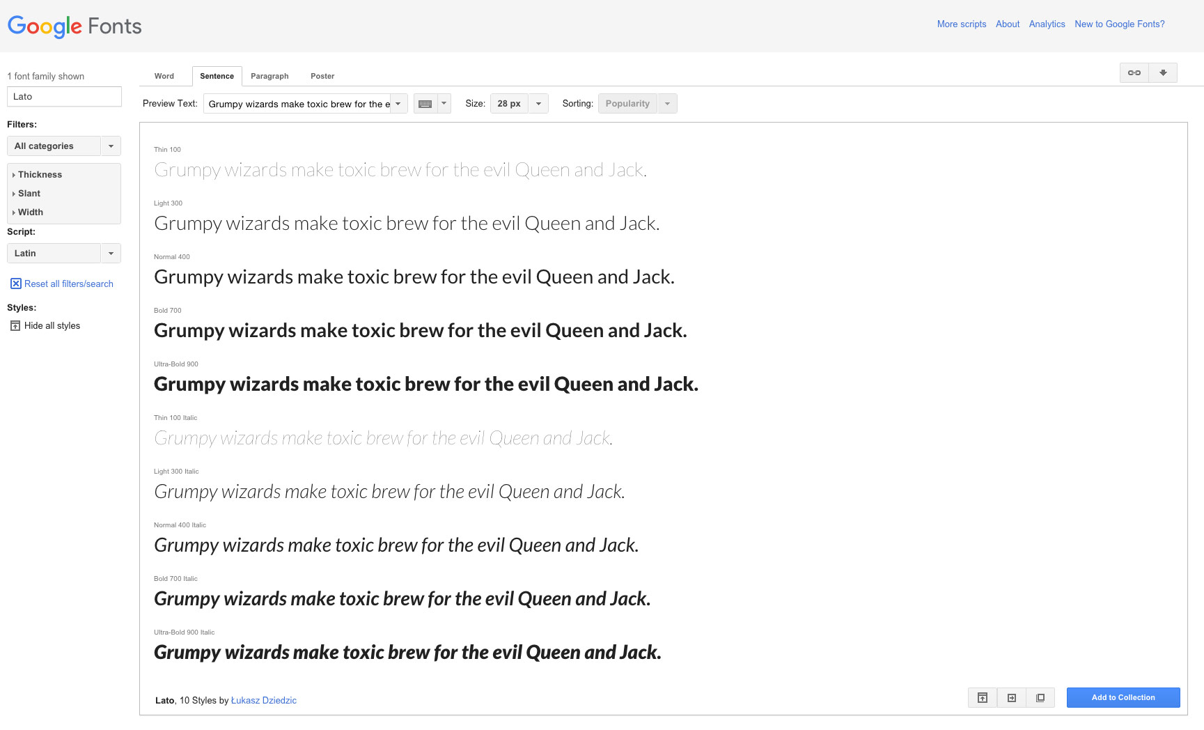
Starting a new design project and baffled about font options? With so many available choices thanks to services like Google Fonts and Typekit, it can be a little overwhelming to get started with a fresh typography palette. So where do you start? Most projects use a couple of type families to ensure consistency and readability throughout a project. (So here, we’ll focus on font pairs that we love.) Then, select a font pair that fits. Select two different styles of typeface – such as a serif and a sand serif – and consider using multiple weights within the type family. Think about the shape and size of letterforms as well. A good tip is to look at the “o” for each font. Do they have a similar shape and slant? The best pairs usually do. If you don’t have time for a full font review ahead of your project, we’ve rounded up a few typeface pairs that we love for you to use in your projects, with a look at the basic emotional connection and use for each font. 1. Lustria and Lato: The serif Lustria and sans serif Lato (a quite popular web font) create an easy to read and interesting pair. Lustria, when use in big type, adds a flair to the design with a light feel and nice flourishes on the letterforms. The result is a type pair that’s easy to use in a number of ways. Lustria:
Lato:
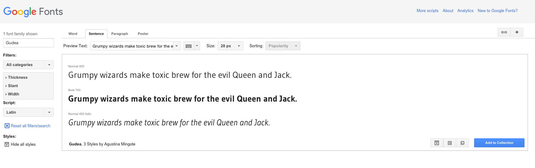
2. Rancho and Gudea: Have a little fun with your fonts. This pairing includes the lighthearted Rancho – perfect for headers – and the simple, medium stroke with Gudea as a body font. The combination has a nice weight to it without being overpowering and could work well in a design that put text over images or a colored background.
Gudea:
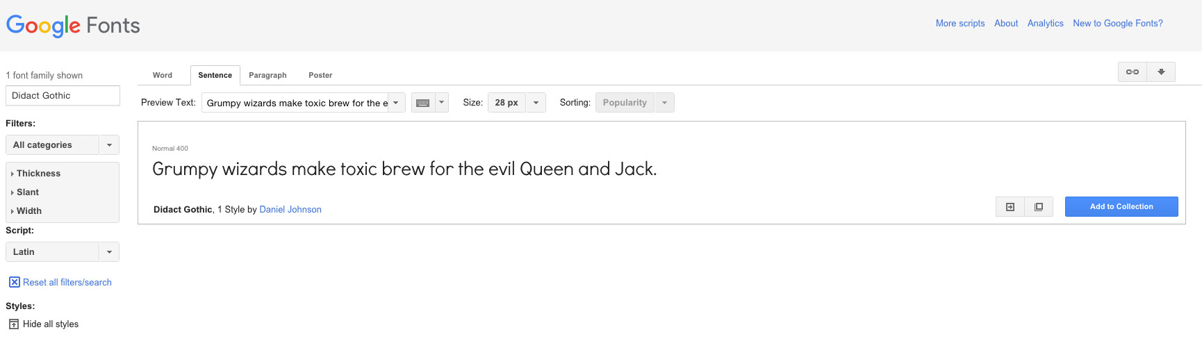
3. Ostrich and Didact Gothic: If you are looking for a headline that features a simple outline style, Ostrich is a fun choice. Didact Gothic works as a simple body font to that does not get in the way. Both typefaces have a somewhat neutral feel and can work in a variety of styles.
Didact Gothic:
4. Rochester and Abadi MT Condensed Light: (http://fontsgeek.com/fonts/Abadi-MT-Condensed-Light-Regular) This fun combination pairs the script Rochester with a simple condensed sans serif for a combination that is light and has a somewhat feminine feel. The idea of the pairing is to maximize text space with the thinner Abadi while adding a lot of interest with a script used sparingly for accent.
5. Myriad Black (http://www.fontpalace.com/font-download/MyriadPro-Black/) and Minion: (http://www.fontpalace.com/font-download/Minion+Pro/) For a different take on projects, try a bold sans serif for headlines and big text and interesting serif for body text. The combination can feel a little too light for some professional applications but has a nice fit when it comes to weight and usage.
6. Georgia and Helvetica: What’s nice about this combination is you would use the fonts in almost any combination when it comes to size and placement, because each type style is fairly neutral. The result when used together is a more formal style that works for sites that want readability without a focus on the text.
7. Playfair Display and Open Sans: There’s a hint for you in the name “Playfair Display” – a typeface with display in the name is often designed for larger use, such as headlines. Playfair Display is such an option with a nice modern look for a serif style. Open Sans is a popular mid-weight typeface that is popular in website design. The combination can be used in a number of ways and tends to take on the feel of surrounding visuals.
Playfair: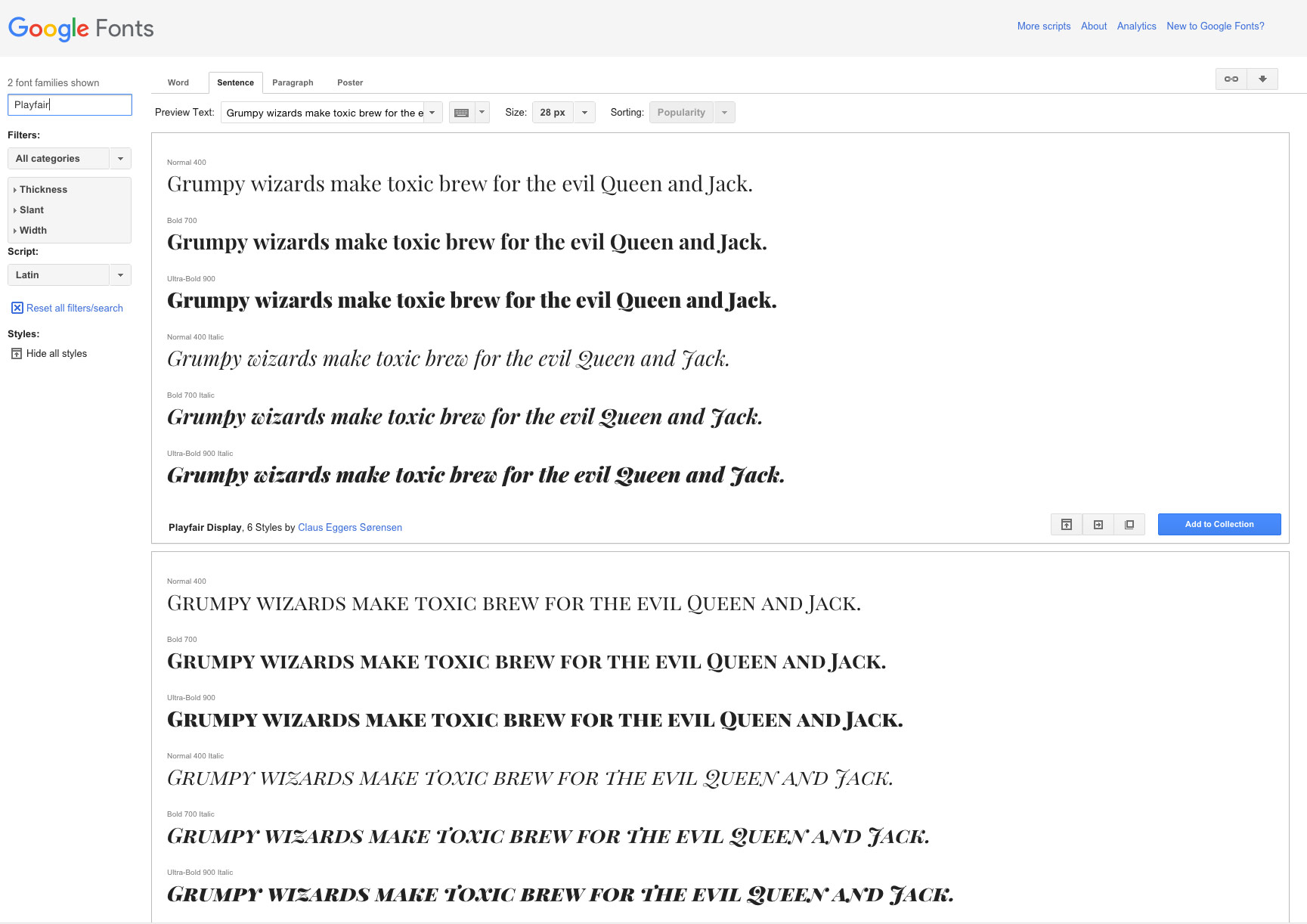
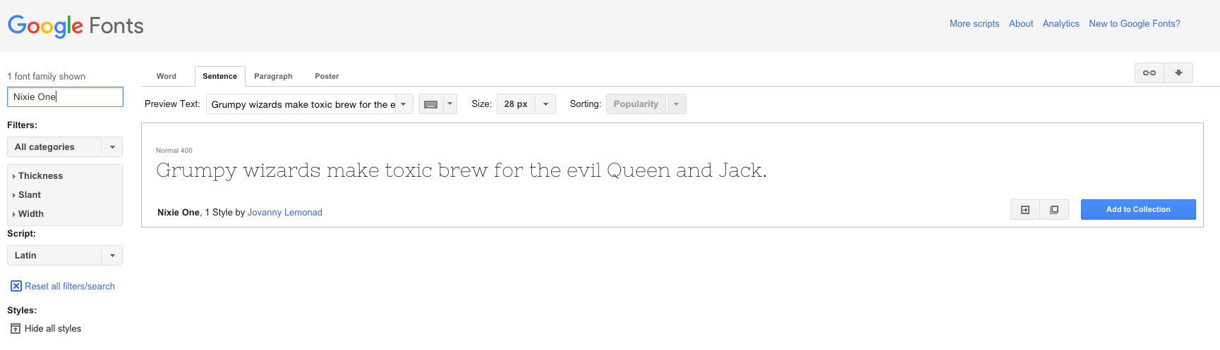
8. Alfa Slab Serif (http://www.fontsquirrel.com/fonts/alfa-slab) and Nixie One: It’s not often in web design that designers pair two serif styles but this combination of the bold slab and thin pair make a stunning combination. The result has a more universal feel, although a bit on the masculine side, that can work for promos posters or other designs. Nixie One:
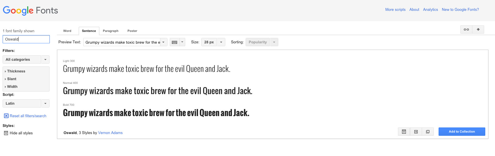
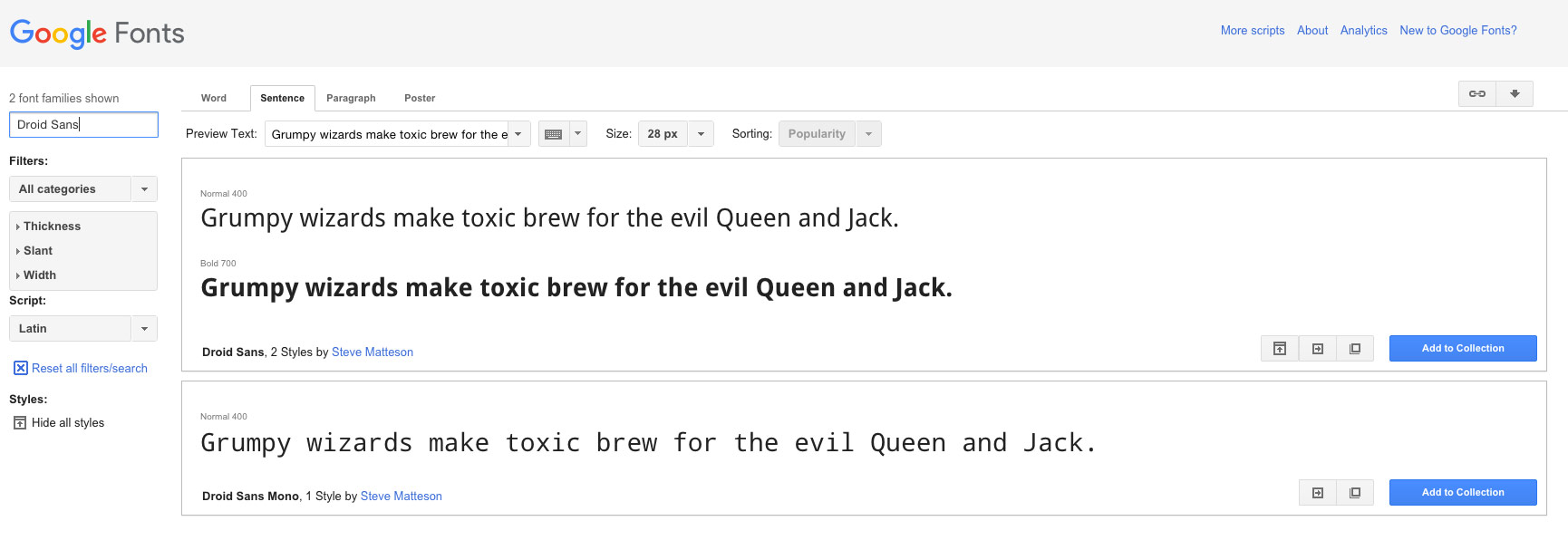
9. Oswald and Droid Sans: Putting together two fonts of any style can be a little tricky, but the pair of Oswald for big text and Droid Sans for smaller lettering can impress. The thick stokes of Oswald offset the simpler body typeface. The feel is quite neutral and can work for almost any project.
Oswald:
Droid Sans:
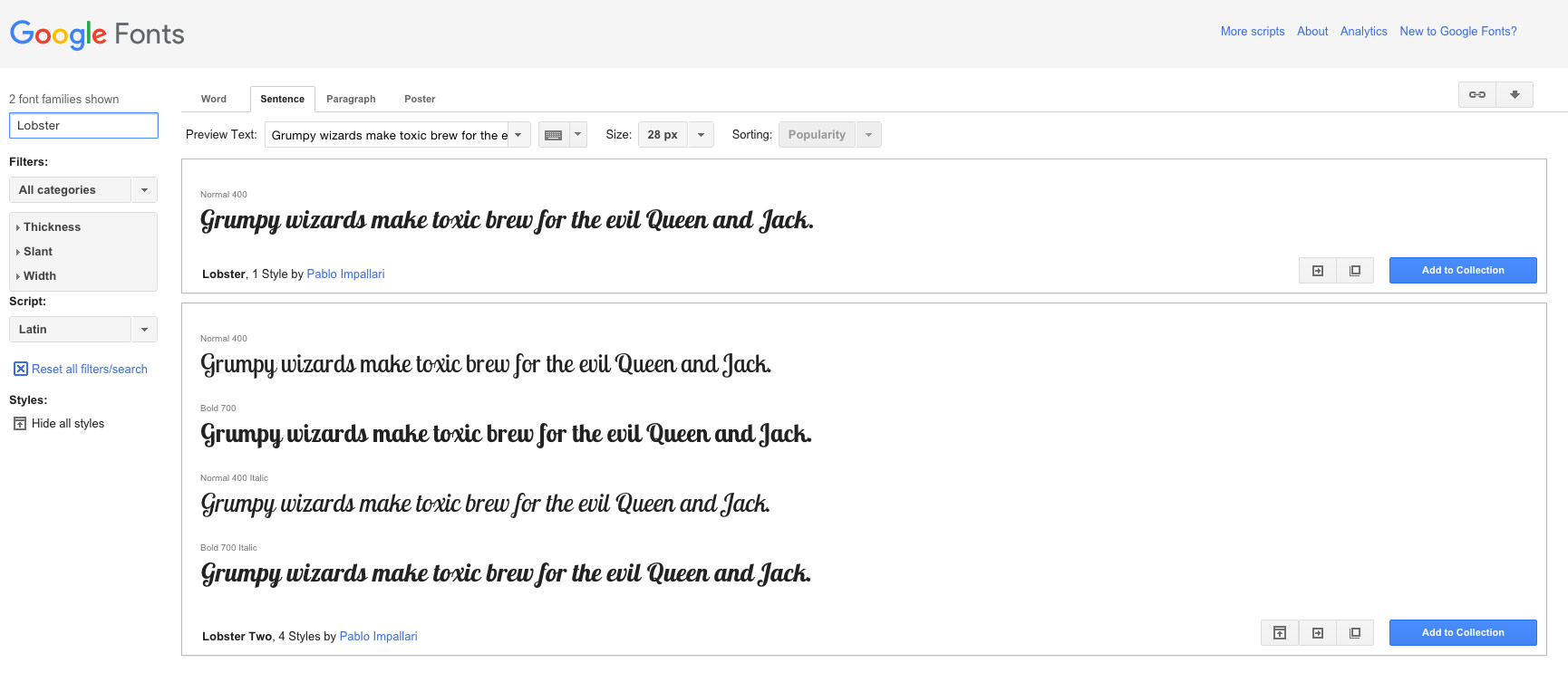
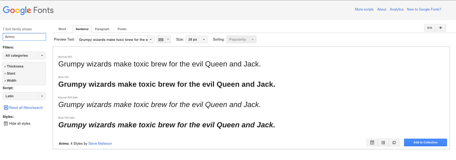
10. Lobster and Arimo: While some designers may argue that Lobster is overused, this is one of the easiest script-style typefaces to use because it does not have a distinctly feminine feel. The thick strokes and simple ties between letters are modern and pair well with Arimo as a body style, which is easy to read and simple. Lobster:
Arimo:

Comments
No comments yet.