Responsive Design Checking For Multiple Devices In Your Browser
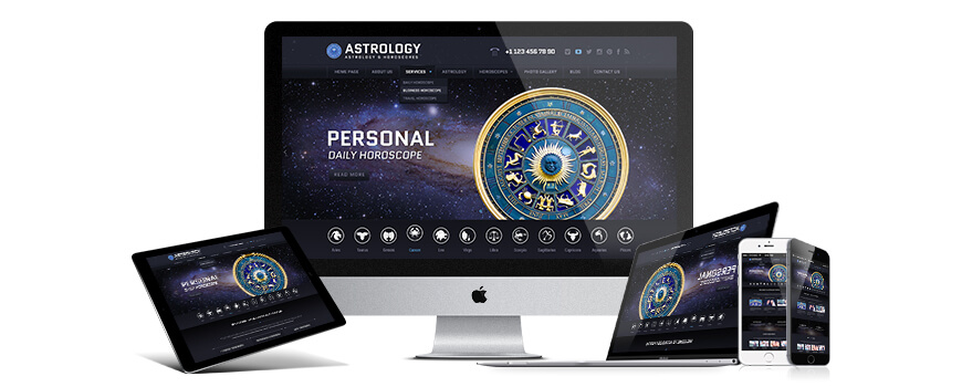
This article is for people who are beginners in designing and not for professionals. Generally, tutorials and assistance are for customers who have a little experience. customers who have bought templates from us have had such question: It is understandable that you sell only responsive website templates, and on your live demo preview page you have special icons for checking in 3 versions,

but the question is: How can it be checked in other devices ?
the answer is simple: browser has a new ability by which you can check responsive design how it works in other devices.
For instance: please open following website https://gridgum.com or any our bootstrap template which we have in marketplace, for checking its appearance in other devices you should click on any place, by right mouse button.
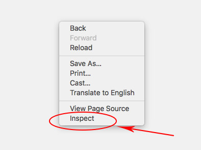
and in the popup window please choose “inspect” (in the other browser it can be named: inspect element). After click, at the end of your screen you will see:

on the full screen it looks like:
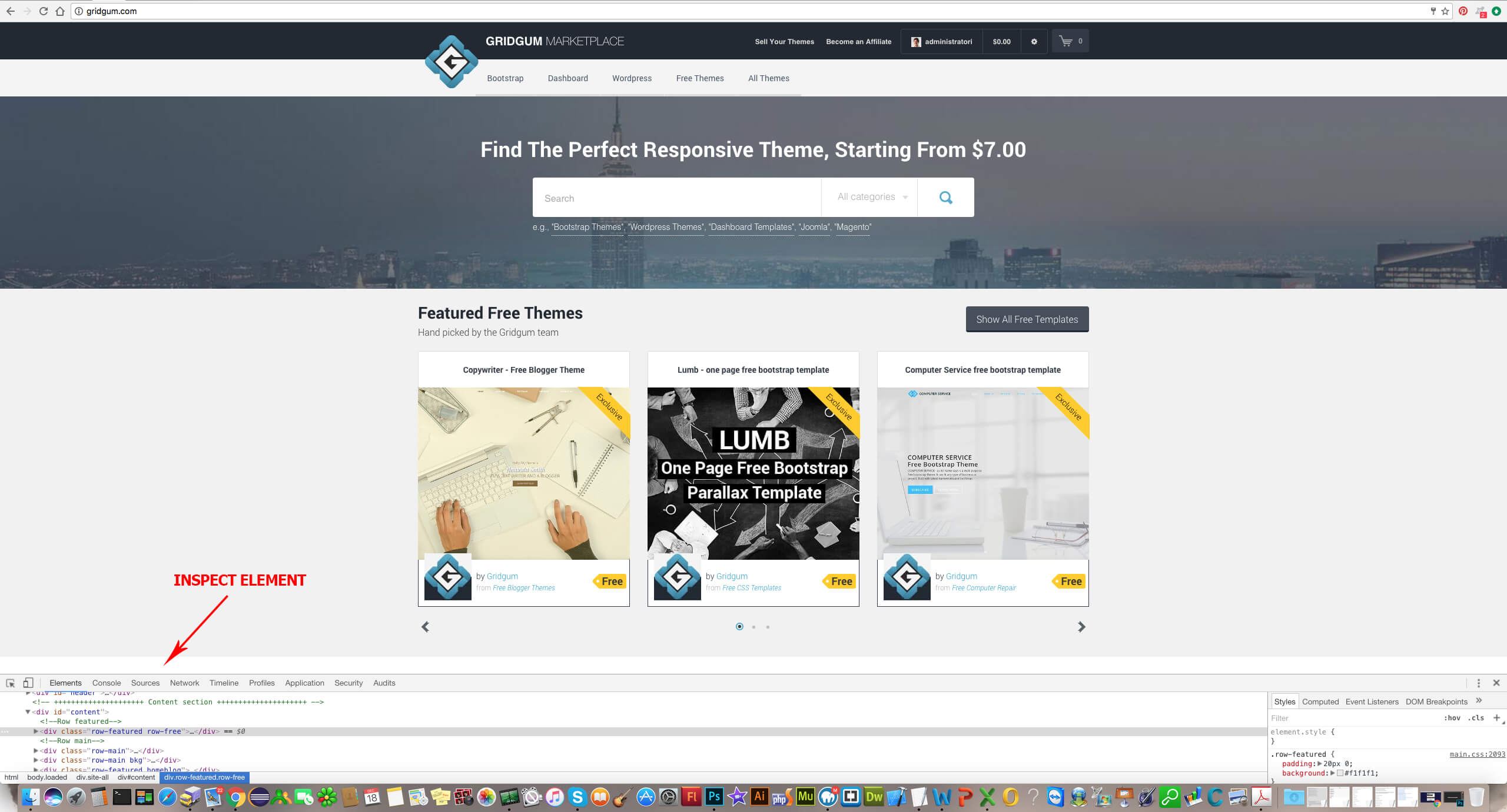
Now, discuss the inspect elements abilities. For checking the responsive, you must click in the end, on a left icon , there are two devices: mobile phones and ipads. See the picture below:
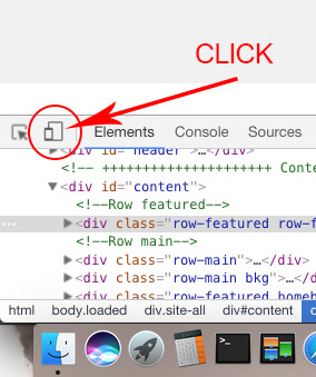
If you click above selected button you will see the following picture:
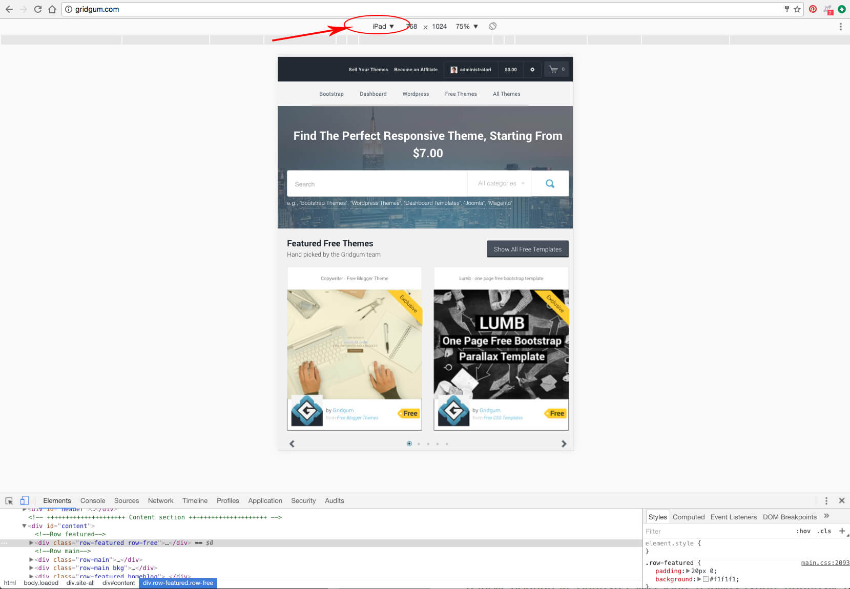
the browser changed its appearance place which is marked above, in that dropdown list can be selected any kind of devices.
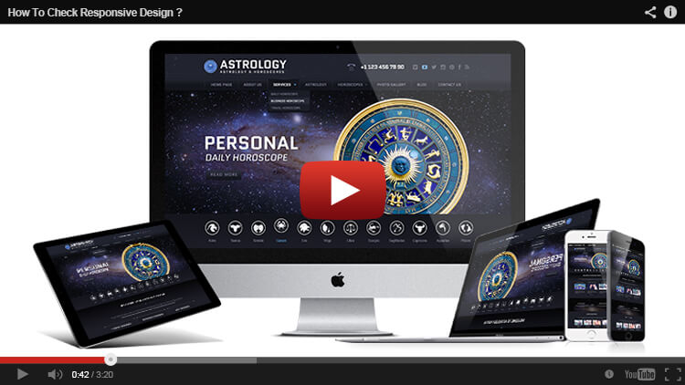
If something is not clear in this article, you can see the video presentation below, there can be seen everything which was written above step-by-step.



Comments
1
1