10 Ways for Minimalism incorporation in Project / 1 February 2017 - 17:20:40
10 Ways to Minimalism Incorporate In Your Next Design Project
While minimalism is not a new design concept, it is a design framework that has seen a resurgence in popularity. The simple aesthetic can bring focus in a design, uses space well and focuses on organization and clarity. Minimalism can work for a number of website types from blogs to portfolios to agency sites or e-commerce pages. If you want to be on-trend, consider adding few visual adjustments that will help streamline your design framework.
- Limit the color palette. Minimal color can still be a lot of fun; just focus in on one hue that you like and use it throughout. Opt for something bright and fun for small accents or consider something darker and moody for a monochromatic-style look.
- Strip out the design tricks. While your design does not have to be stripped down to the level of the flat style, you should strip out most of the tricks when thinking about a minimal framework. If you are going to use a trick such as a gradient or drop shadow or animation, stick to one such element.
- Use plenty of space. A key concept when it comes to minimalism is space. Incorporate a little more space into the overall design than you might be comfortable with to start. Get used to the more open feeling of the design before you start to add elements back into the layout. And remember space does not have to be white, space on a background is ok too; the goal is to give each element room to stand on its own.
- Use a single font family. Use multiple weights or sizes of a single font to emphasize the simple nature of the design. Opt for typefaces that use clean lines and strokes and are easy to read. If you use a high-drama type style for the big words on the screen, you can add a secondary font for other text elements, but use a style that is simple as possible – likely a sans serif with a uniform and medium stroke width.
- Make your logo white. One of the things that can be tough when working with logos is all the color. Especially when you put a logo next to (or inside of) an image or with a bit of text. Take the logo back to its skeleton and use it without color. The simplified logo should still stand out when used with other elements that offer plenty of visual stimulation.
- Use a defined grid. Minimalist frameworks are organized. Set a grid for the design and stick to it. Unlike with some other styles where you don’t want to see how the grid falls, minimalist styles often fall into distinct grid patterns. If this is not something you have done before, it can be a fun change of pace.
- Think in geometric shapes. Think outside the box when it comes to the shapes for images and other elements. Create a site outline that uses another style of geometric shape to create interest in an open and minimal design scheme.
- Simplify the language. The words on the screen should have the same feel as the rest of the visuals. Make sure to use simple, plain and direct language so that the visual and readable tone match.
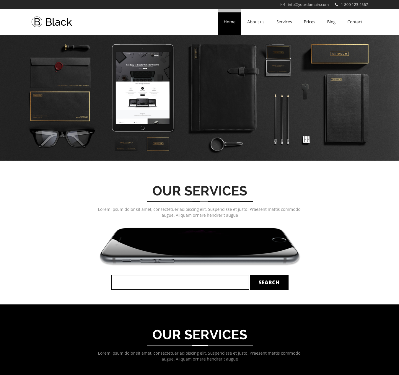
- Think in black and white. It may seem a little cliché but many minimal frameworks focus on black and white color outlines (with maybe one brighter accent hue). The lack of color can help emphasize the simplicity you are trying to convey and help the design come together. When in doubt with a minimal design project, strip every element away and build the design back slowly with intentional pieces.
- Hide the navigation. Consider a hidden navigation style for minimal designs to increase the amount of whitespace available and to remove clutter from the canvas. Hamburger icon menus are a popular option as are navigation options that slide out as a sidebar or from the top or bottom of the screen.
Share:
Tags:
web
COMMENTS
Categories


Comments
No comments yet.