So you may think, fonts are only important to web designers, well I’m here to tell you-you’re wrong. As a blogger, I see that when people enter your blogs, they don’t only pay attention to what’s actually written in your post. They find much interest in the overall design and, as the vital part of that design, beautiful fonts. Why is it important to use the appropriate fonts on your website? Like an ugly front door and porch will make you NOT want to go in the house, unsuitable and ill-favored headline will not motivate website visitors to actually read your article.
Choosing the correct font is not easy. Some might even consider it to be challenging, while others think that it doesn’t really matter what font is used. For the texts with small characters that are dragged somewhere in the corners, they are right, but choosing the correct font for headlines and other titles is crucial for maintaining your readers. There is a variety of Google Fonts. You just have to browse through them and find the one you like, the one that suits your design, something bold, with a little detail, but clean and easy to read. If for some reason you are not able to do so, just read through this list of 5 most popular fonts of 2016.
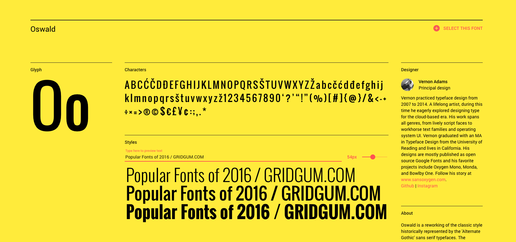
So the 5th place goes to Oswald. It was developed by Vernon Adams. It has a classic design which is bold enough for headlines and simple enough for the body texts. https://fonts.google.com/specimen/Oswald
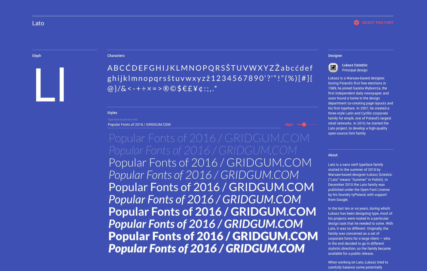
The 4th most popular font according to Google is Lato. Compared to the previous font this one has wider characters. Lato has semi-rounded details, which, according to Google is “Male and female, serious but friendly”.
https://fonts.google.com/specimen/Lato
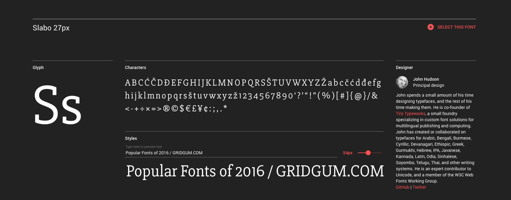
The 3rd place is occupied by Slabo 27px. This font is mainly popular in online advertising. The Slabo collection also has this font in 13px. Each of these fonts is “Fine-tuned for use at the pixel size in its name”.
https://fonts.google.com/specimen/Slabo+27px
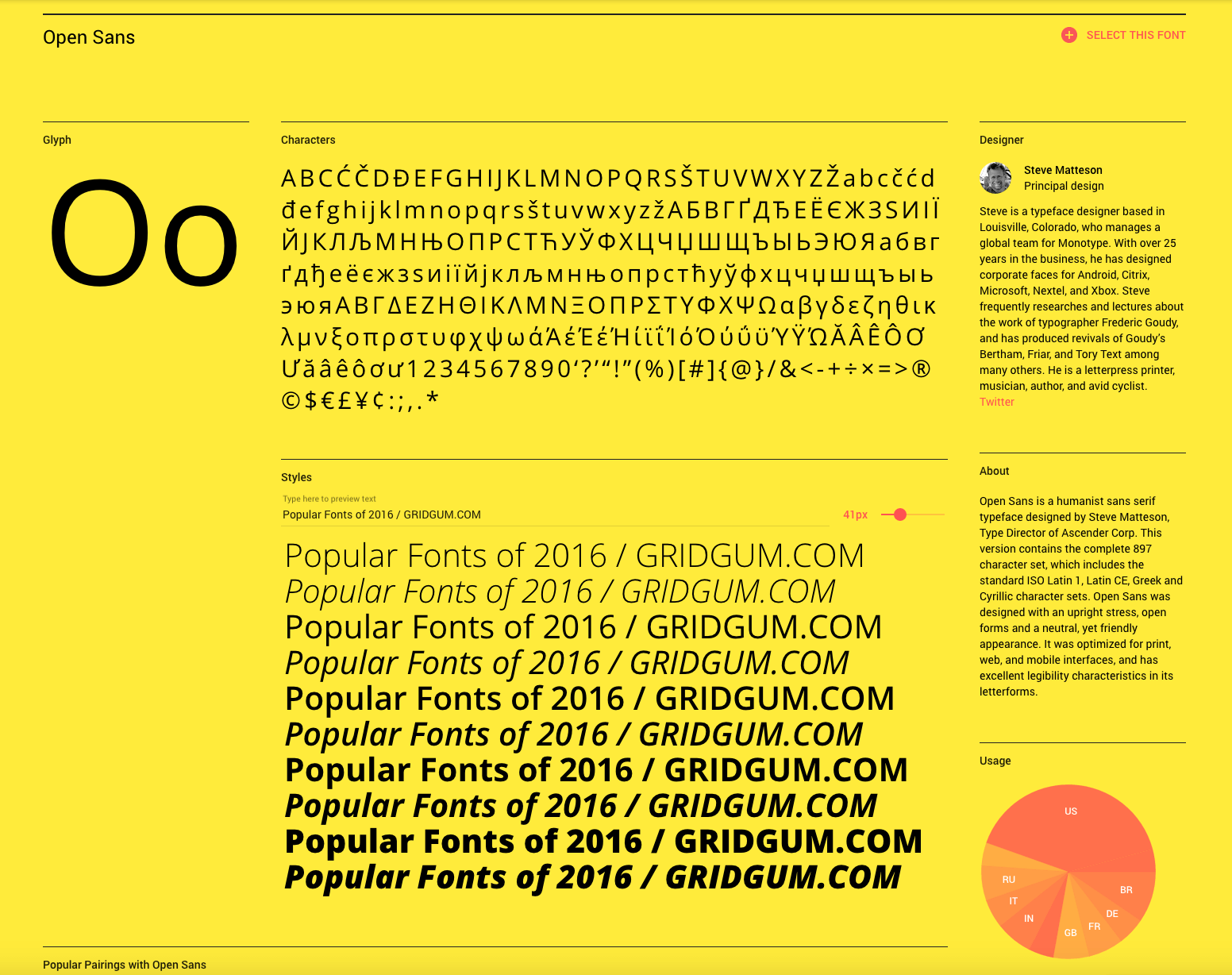
The 2nd place goes to Open Sans. Designed by Steve Matteson, this font has not only English, but Latin(1 and CE), Greek and Cyrillic sets. Open Sans doesnt have much detail,which makes it easy to read and therefore perfect for body text. www.Shopify.com mostly uses Open Sans font.
https://fonts.google.com/specimen/Open+Sans
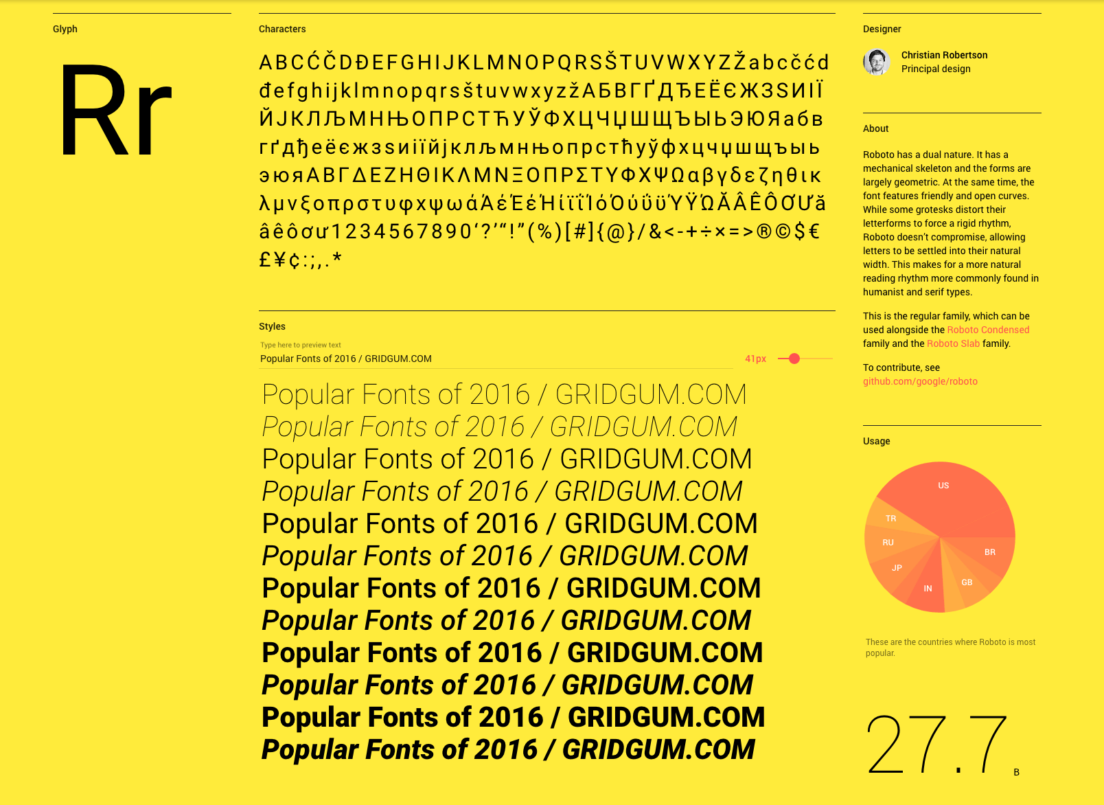
Finally, the most popular font is Roboto. This beautifully simple font has high legibility, which is why it will look awesome in small characters of body texts and thanks to its geometric forms and Bold, Black and italic styles, Roboto is perfect for headlines and titles.
https://fonts.google.com/specimen/Roboto

Comments
No comments yet.