BRIEF HISTORY OF WEB DESIGN

Everything evolves through time, as did web design. World Wide Web pages weren’t always filled with such flashy fonts and bright images, as they are today. While design and coding were always connected, it rises a question, as to, how come designers can’t write code and developers don’t know design, how did these two become separate fields in the first place?
Nowadays, it’s hard for everyone to imagine a world with no cellphones, no computers, no internet and no other modern-day gadgets. But, we know as a fact that time existed and when internet was created, it wasn’t the thing that took people’s precious time, it didn’t hold that big of a place in people’s everyday lives. Most people don’t even know what first web pages looked like.
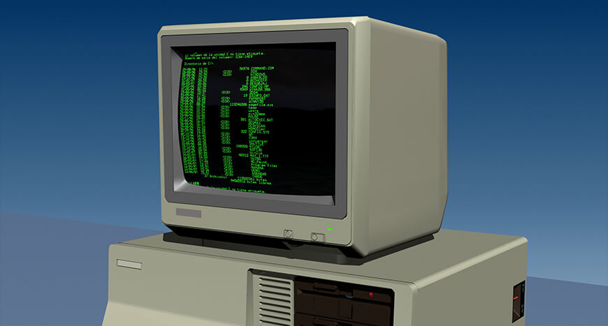
The dark age of web design (1989)
The start of web design history is also the start of a computer, which to that time was described as a typewriter connected to a TV. It had a black screen and green symbols, so just a few monochrome pixels. The whole “design” if we can even call it that, was made by letters, symbols, punctuation marks and tabulation (tab key).
The beginning of image display (1995)
The creation of web browsers that could display images was the first step to making website designs a bit more complex, and in addition to just images, it gave web developers some space to develop something else, something like tables. The concept of tables, that already existed in HTML were the easiest option available to structure information. The main purpose of tables was to display and structure numbers, despite, it was still a common method to update webpage designs. Developers were provided with fancy designs and it was up to them to figure out how to make those designs work, so they used tables, because they could align things vertically and define them by pixels and percentages.

The time JavaScript comes to the rescue (1995)
JavaScript was the tool that helped developers to reach outside the limits of HTML. It’s original name was Mocha and was created in only 10 days. If you wanted to create popup windows and other design elements JavaScript could make that happen. Nowadays developers like to use CSS instead of JavaScript, if both of these coding languages can deliver the same features, but at that time JavaScript was the new language that could make elements, HTML couldn’t. However, it had some problems too, like JavaScript code is layered on top of the code that makes web work, so it has to be loaded separately.

The era of freedom- Flash (1996)
Flash allowed developers to break free from the limits of that time’s existing web design. After the birth of flash designers experienced a freedom of choice, that was never seen before- they could make any shapes, animations, layouts and fonts-all with the help of this one tool. Flash, however wasn’t too open to search and consumed a lot of power, which is why Apple decided to abandon it and thus, made the first steps towards Flash’s demise.

CSS emerges (1998)
Two years later, when Flash was all the rage, a better approach to structuring design came along- Cascading Style Sheets(CSS). The basic idea was to separate the content and the presentation, so the formatting was in CSS and the content in HTML. This sensation had some downfalls as well, like the time it took some web browsers to fully support it, so most of them had a hard time adapting it.

Responsive Webpages (2010)
If we fast forward through the first attempts of mobile browsing, we get a modern version of mobile-friendly responsive webpages. The time when this was first developed, other computer devices except PCs, were just starting to become popular tools for browsing. This concept still uses HTML and CSS to adjust the size of webpage content-shortly, responsive websites look good on PCs, laptops, phones, tablets, smartwatches and etc. Nowadays, devices like these mentioned above have become more popular tools for browsing than PCs ever were. Today, most of the websites are fully responsive. Please see all our Free responsive bootstrap templates here: DOWNLOAD FREE RESPONSIVE THEMES

If one overlooks the whole history of not only web design, but internet browsing in general, it becomes quite apparent that all of these developments were made during a short period of time. It’s like having whole history shrunk into a small time period, but in this case it took exactly that much time to make these advancements. If we judge by the past and consider that we are looking at a newly created industry, we should await some pretty awesome innovations in the nearest future.


Comments
No comments yet.