Web Design 2015, Blog Post / 4 February 2017 - 20:31:28
Website Design Of 2015
What will web design will look like in 2015?
2014 is more than half way over, and it’s time to start looking ahead. What will be the web design trends for next year? Although it’s a wee too early to speak in specifics, there are certain trends that are gaining momentum and will blast full speed ahead into 2015. If you’re not already familiar with these trends, get familiar. Here’s your opportunity to get ahead of the masses and future proof your design. Let’s take a look at what web design will look like in 2015.1. Ghost Buttons
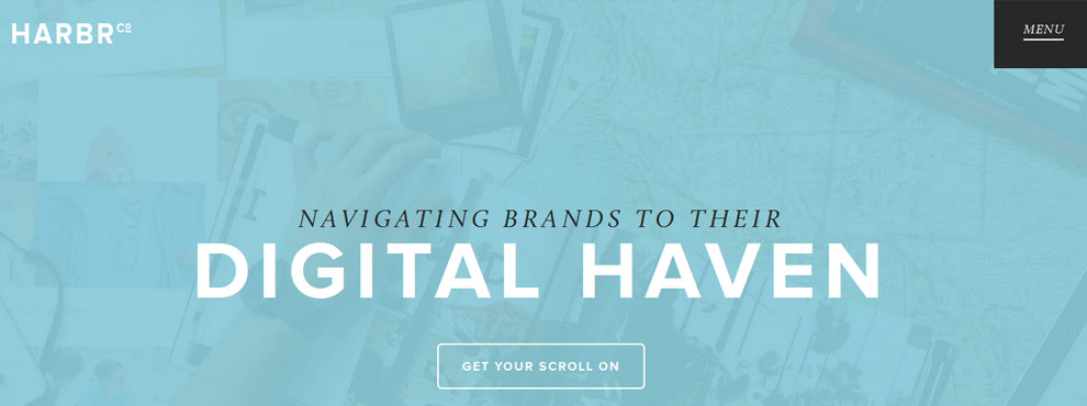
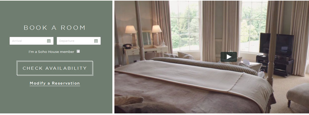
Taking flat design to its most extreme conclusion, ghost buttons are transparent calls-to-action often framed by a thin line. They are often described as elegant and minimalist. Ghost buttons rarely scream for attention like skeuomorphic counterparts, but they do stand out in their own quiet way. Some designers add a hover effect to acknowledge function. Here are a few examples of how ghost buttons trend to elevate any design:http://www.babingtonhouse.co.uk/
2. Card Design
Inspired by Pinterest, many web designers have recreated the tile look on their websites. However, card-based design is not just about aesthetics, it’s also about function. A true card in interactive. It’s not just a rectangle of information, a card prompts action. Cards ask users to share, pin, add comments, or otherwise engage.3. Background Videos Will Continue
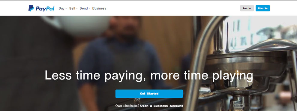
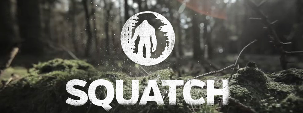
Videos are compelling. They say a picture is worth a thousand words. According to Forrester Research, a one minute video is worth 1.8 million words. Fortunately, HTML5 makes background videos more accessible.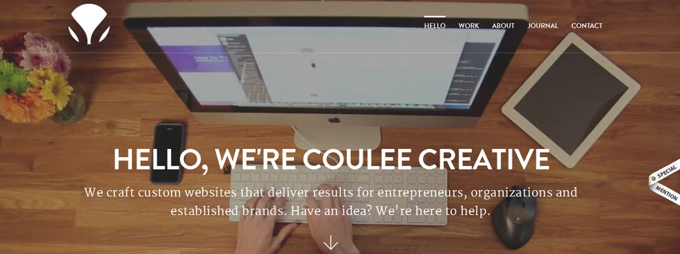
4. Interactive Storytelling
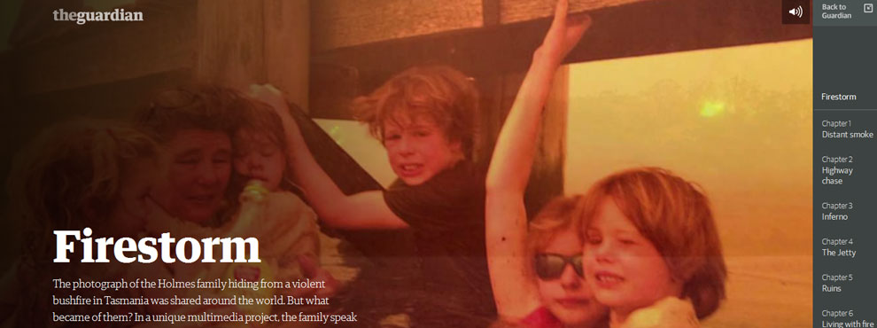
Visitors want more than text on the screen. Savvy designers are finding a way to share stories with their audiences, and pays off with increased engagement. Not every site is suited to a full-blown narrative, but even hard-hitting journalism can benefit from adding interactivity in their articles.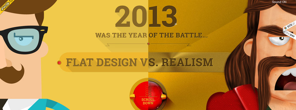
http://www.theguardian.com/world/interactive/2013/may/26/firestorm-bushfire-dunalley-holmes-family
5. Personal UX
YouTube does it. Netflix does it. You can do it, too. Put those cookies to use and make personalized, targeted content. It’s much more engaging to recognize a returning visitor by saying “welcome back” than it is to present the same content. You can also add a plugin to your blog that highlights new posts that have been published since the previous visit.6. Responsive Design
No list would be complete without a nod to responsive design. More than half of all Americans (58%) own a smartphone and 42% own a tablet computer. That number is expected to climb. If your website is not responding to different screen sizes, it’s stuck in 2008. Asking visitors to pinch-to-zoom is a travesty. Instead of making your visitors work to get your content, accommodate them with good, responsive design. Take some time to figure out how users access your site. If you find that a large portion of your users visitor via mobile devices, you should definitely make your design fit smaller screens. In Closing We still have a few months to go to see what becomes of these trends in 2015, but there’s no doubt that they’ll be around. Share your thoughts with us in the comments. Do you have a favorite trend that you think will be important in 2015? [ssba]Share:
Tags:
responsive design
COMMENTS
Categories



Comments
No comments yet.