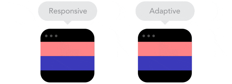
Similarities & Differences Between Adaptive & Responsive Designs

• Are these two the same thing, or does “adaptive” mean something else entirely?
Responsive website design is the term we should all be familiar with by now. If there are some of you left, who still don’t know what responsiveness means, I’ll start by a brief description.
Most of the websites today are device responsive. This means that they can change their design according to the screen and browser window size, at any given moment. If you slowly start to reduce the size of your browser window you’ll see how the design elements change their location, shape and size. Everything falls to place even in the process of downsizing.
So, if responsive design adapts to the screen and window size, then what does adaptive design do? And, in addition to this, where does “fluid design” fit in ?
While browsing through the web doing some research about this title, I came across a very interesting definition and examples of the two designs. www.sitepoint.com author defines these two designs by comparing them to a selfie stick and an umbrella. Since these examples were really unclear I couldn’t wait to read more.
So, as it turns out, responsively designed website works just like a selfie stick, selfies look good and can be taken with a stick at any given length, from fully retracted to fully extended and everything in between.
Adaptive design has some resemblance to an umbrella, which has only two states: open for when it’s raining and closed for when it’s not. Adaptive design similarly has only two sizes that design adapts to, only at specific breakpoints.
There’s another definition of the two design styles, surely not everyone can agree with one opinion, so a new kind of explanation emerges on the horizon. This different description says that both of these designs have the same characteristics – they both change their appearance based on the browser size and environment, but while responsive design “responds” to a browser size at any given moment, adaptive design “waits” for a browser to be at specific width and only then it adapts the layout. So, this explains the designs’ differences as “smooth” (for responsive) and “snap” (for adaptive) changes. Responsive design can be both fluid or fixed and so can adaptive, but responsive design doesn’t care about what type of browser is used, it responds just to the size and changes layout accordingly. Adaptive design, on the other hand, adapts to the browser’s environment specifically and may not consider browser windows’ current size.
So, fluid design is responsive design first and foremost, since responsive design isn’t fixed very often. The main concept here is that fluid design and browser window size are like liquid and different sized containers respectively. Fluid design perfectly fits and fills every inch of browser space.
Turns out, there have been some arguments about this topic. Web designers debate over which is what, and which is better. I say, there’s no clear answer. This choice might be easier to make if you had certain devices your site must support or some extra precise elements your website should have.
The bottom line is that both of these designs have the same goal, reached by different methods. They are both means to fix a problem - most of the websites today are often viewed on different devices, thus different screen sizes and web design should look good on all of them.

Comments
No comments yet.