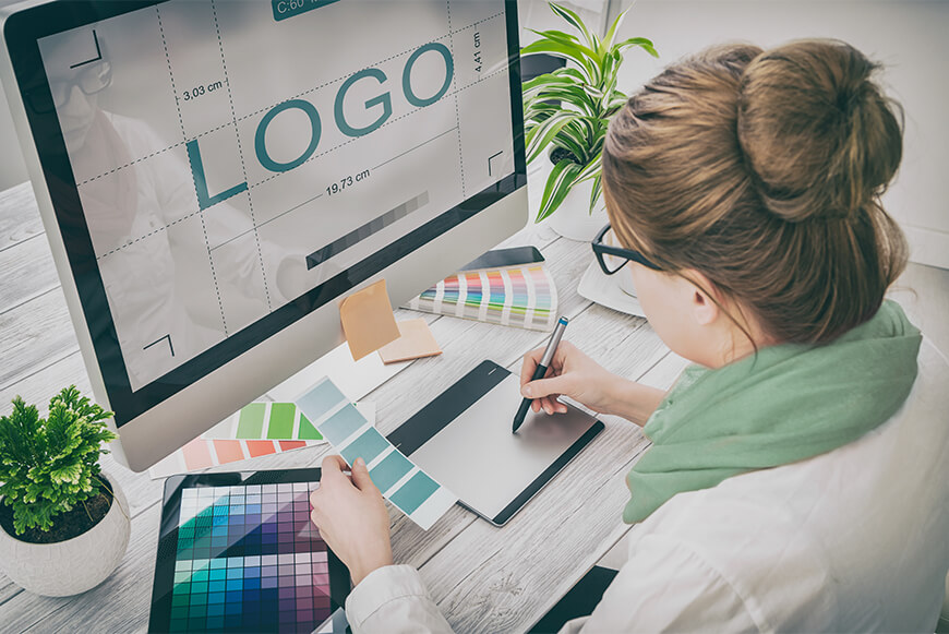
LOGO Creation Process

Branding is one of the most important parts of any kind of business which can be small, medium or large. It creates a perception of the customer when he/she thinks, hears, and sees about your product. The brand is built by many different components for instance name, slogan, symbol, the design of the symbol and etc. But the most central building block of the brand especially for the websites is a logo because it is shown every time someone visits your webpage so it has to be really good.
Not really long ago web designers or simple owners of small businesses would not spend that much time or effort on designing logos they would simply use some basic tools and free fonts to create one. But nowadays it has changed into the big game, in most of cases the professional designers are hired to think through every step that is necessary to create logo. But of course not all of us have the sufficient financial resources to hire the designers to work explicitly on logos and want to use our designing skills to create one. Therefore this article is dedicated to show how the logo creation process goes step by step.
- 1. Simplicity
In most of cases the simple logos are remembered easily and for a long period of time. When you create the logo try to avoid too much details or elements which make the eyes to remember the design of the logo very complicated. Too many details confuse the customer because he/she loses to track and does not know on which element to concentrate. Think about the great logos as are Google’s one, it is just 5 different letters represented by various colors. If you look at it once it is more than enough to remember it forever. - 2. Avoid Trends
During each year there are some trends which influence the designing, including the logo design but try to avoid those trends. Of course you want to fit into the requirements and frameworks of the design therefore following the trends is a good idea but actually it is not. Trends are creating the mainstream which is used over and over by various businesses and eventually all their logos look approximately the same. Stick to your own ideas and stand out from the other trend followers. - 3. Color
It is considered that colors are playing a very important role during the creation of a logo because they can represent the human feelings, emotions and even culture. Therefore when one chooses the color of the logo he/she has to be very cautious. In the best case scenario the designer has to have rigid understanding of the color psychology to create the logo design that fits them best. One must also know that the variation of the colors even the slightest one can influence the customer in a different way therefore it is an important to choose the right blend of the shades and colors. - 4. Place
Try to use the logo everywhere you can, not only on the front page of the website but also everywhere it can be fit. As often the customer will see the logo the better it is for your website recognition. Therefore you might need to design not only logos but logotypes (just one symbol that represents the logo) or glyphs which are simpler reflections of the logo and also smaller in the size therefore they can fit into every available space on the website.
Your logo is the reflection of your website and the product/service that you offer so take the designing process slowly and think out of box. If you are a designer then these tips should be very helpful and you can design the desired logo by yourself but if you are not experienced with designing but want to have logo then spend a little bit of money and hire the professional. There is always needed a sacrifice (of course in financial terms) to achieve the desired and better outcome.


Comments
No comments yet.