Best Design Practices 2014

Good design doesn’t happen by accident. Good web design is not fickle or subjective. It never sacrifices function for appearance. Web design is always slave to content. Although it’s great to add personality to your design, never allow your design to interfere with the content. Yes, web design is an art, but fortunately, it’s also a science. This means that we can recreate good design as long as we understand and implement key principles. Let’s take a look at the best design practices for 2014.
1. Responsive Design
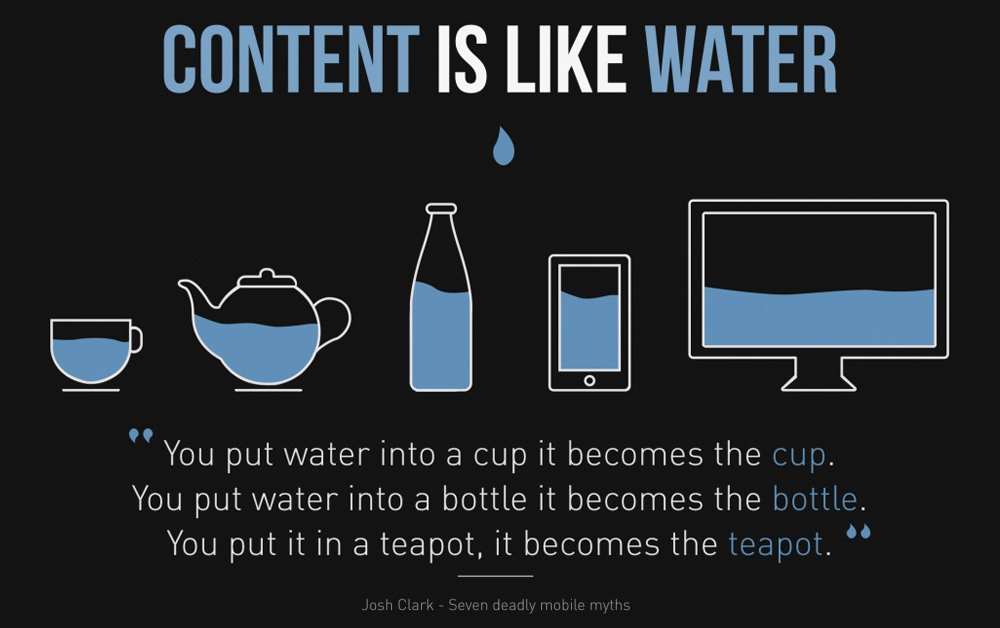
 Mobile browsing is the future of the Internet, but it’s already important right now. Approximately 55% of Internet usage comes from mobile devices. An unresponsive design may disappoint users who visit your site from their smartphone or tablet. If your website isn’t mobile-friendly, that’s now your number one priority.
One of the most important things to remember in responsive design is button size. Make buttons at least 44 x 44.
2. Clean Navigation

Good design means that users understand where to go and how to get there. Overall, the design elements on your site should be directing users to valuable content. If there’s a pot of gold, but I don’t know how to get to it from your poor navigation, I’m just going to leave and search for a different pot of gold somewhere else. Make your navigation understandable for your favorite grandmother-- if she can find her way around, than you’re following best practices.
3. Compelling Colors

Although we’re looking for a pot of gold on your website, we don’t need a rainbow to get there. Keep your color scheme to a maximum of three colors. Choose colors that convey but do not distract from your message. There’s a psychology to colors. Here’s how it breaks down: Red- Bold, Exciting Orange- Friendly, Confident Yellow- Happy, Warm Green- Peaceful, Growth Blue- Stability, Sincerity Purple- Passionate, Luxurious Gray- Security, Maturity Black- Sophisticated, Powerful
4. Emphasis on UX
 User experience is the heart of effective web design. When done right, a user shouldn’t even notice the individual elements of your design, but rather the overall story it tells. I may not notice the space between your icons or whether they are hand-drawn, but I should understand what each icon means, without much effort. Remember to design for experience, not for cheap thrills.
5. Make it Social

Your website is not an island. More than ever, users crave social interaction. It’s almost second nature for a user who’s interested in your content to seek you out on Twitter, Facebook, Google+, or the like. Make it easy for them by adding social media badges in your footer and on your contact and about pages.
6. Keep It Consistent

Every page of your design should look like it belongs together. There’s nothing worse than ending up on a page with an outdated logo. Actually, there is something worse-- trying to find the navigation that’s no longer in the same spot. Keep your header consistent, keep your navigation consistent, and keep your overall tone consistent. If you have a blog, make the voice compatible to the overall tone of your site. In Closing Remember that good web design isn’t mysterious. Follow these practices to make your design engaging and user-friendly. What is your favorite practice for good web design? [ssba]


Comments
No comments yet.