2014 Responsive Design - Top 7 Tips / 7 February 2017 - 15:44:20
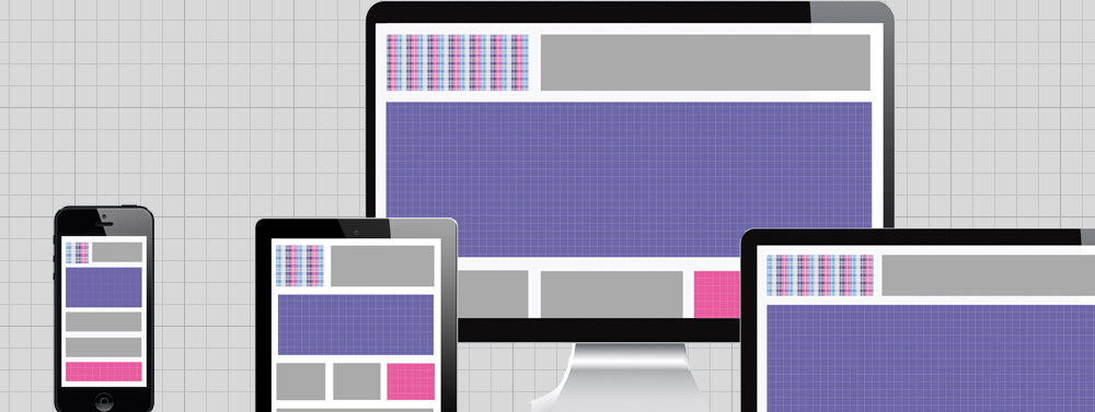
Top 7 tips for Responsive Design 2014
Once upon a time, web designers could predict screen resolution with an almost certainty. For the tech savvy, it was 1024 x 768. For everyone else, it was 800 x 600. And, if designers really wanted to control user experience, they’d slap a “Best Viewed at 1024 x 768 with Internet Explorer” near the bottom of the web page and call it a day.
Although this may seem like an ancient practice, it was only 10 years ago. But nowadays, we no longer need to design for one type of browser and one type of resolution. In fact, we no longer should. Here’s a couple of startling statistics for you:Over 1 billion people access the internet over mobile devices worldwide.
Approximately 34% of smartphone owners use their phones exclusively to search the Internet. These people don’t use laptop or desktop computers to go online.Both of these numbers are expected to climb, as more and more people get smartphones and mobile devices. Is your web design ready? This is why responsive web design is so important. Responsive design makes our sites viewable on different devices without compromising style and function. Yes, responsive design is still young. Most designers aren’t even implementing it. Those who do may be doing so inefficiency. If you’re confused about responsive design, never fear! We’ve got you covered. Let’s take a look at the most important features in responsive design, and what you need to know to future-proof your design.
1. Mobile Means Different User Experience
 Avoid taking a one size fits all approach to your responsive design. A user visiting your site on a mobile device may have a different goal in mind than one who visits you on their desktop. Smartphone users generally want to find quick answers to their queries. Tablet users may want to read long articles during a commute. Think of how users will most likely interact with your site on different devices and plan accordingly.
2. Design for Mobile First
 When you’re planning to design your website, think about how it should look and respond on mobile devices first. It may seem weird but, as you can see from the above statistics, mobile is starting to overtake desktop. Design a site that looks great small, and it’s much easier to scale up.
3. Design for Landscape and Portrait
 Many mobile users switch between screen orientation, but landscape (59.8%) has an edge over portrait (41.2%). Make sure that your design looks perfect both ways.
4. Speed Is Everything

5. Percentage Over Pixels

6. Bring Videos In On the Action

7. Test It

Responsive design is not a fad. It’s a necessity. The science is far from perfect, but the more we all tinker around with it, the better responsive design will be in the future.
What’s your favorite part of responsive design? [ssba]Share:
Tags:
responsive design
COMMENTS
Categories

Comments
No comments yet.