Which one will take over, responsive or adaptive design?
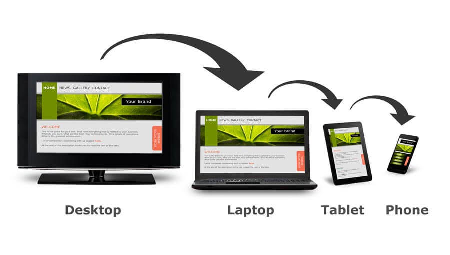
Nowadays, mobile phones are more frequently used than personal computers therefore every website must also be accessed from mobile phones. It might surprise you but accessing the website and using it through the smaller screen is not enough. The design and content of the website have to be altered as well when it is opened from mobile phone.
In most of the cases the websites are responsive meaning that they change the design based on from which devices they are opened but apparently it is not enough. The majority of new websites are responsive thanks to the easily available online templates like WordPress, Drupal and Joomla. Even though responsive design is very easy to build and afterwards work with, it still does not offer as much control as adaptive designing.
Issues with Responsive website
Representing data on a smaller screen makes it complicated to read or see the content which frustrates customers. So not only the design but the content of a website has to be changed to demonstrate your customers that you care how they are getting the information. Altering the content might mean eliminating some of the information because too much data is very hard to be handled for mobile devices. And most importantly responsive design does not give a chance to see the customer’s perspective but rather the company’s one. In other words, businesses think about what information should be displayed but no importance is given how that information will be perceived by customers.
But what can be solution to that ?
I would simply suggest an adaptive design method because it does not assume that the content and functionality should be similar across all devices. But on the contrary the main idea of adaptive designing is to match the content of website with the device it is opened through. Adaptive designing gives an opportunity to maximize the customer’s experience through shaping the design and information to the device. For instance, if the customers is accessing your website through her or his phone display your contact information to contact you easily. But what about if customer is using a personal computer to access you? Then its better to display the product or service information that is offered by your company. In other words, explore what your customers are searching for when they are using various devices and use that knowledge to maximize customers’
satisfaction.
When one is constructing the website, customers’ perspectives have to be taken into account regardless which device is used. If they are using their mobile phones then you have to be ready to present all the necessary data easily without any confusion. If you do not make this process smooth and enjoyable then eventually they will search for other businesses with similar services or products.
Of course responsive designing has its own benefits but when it comes to decision just consider what experience you want to deliver to your customers. Adaptive designing is more complicated to build and work on but the result is absolutely worthy of it.
All our responsive and adaptive designs can be seen here: Bootstrap Responsive Website Templates

Comments
No comments yet.